Better horizontal bar charts with plotly
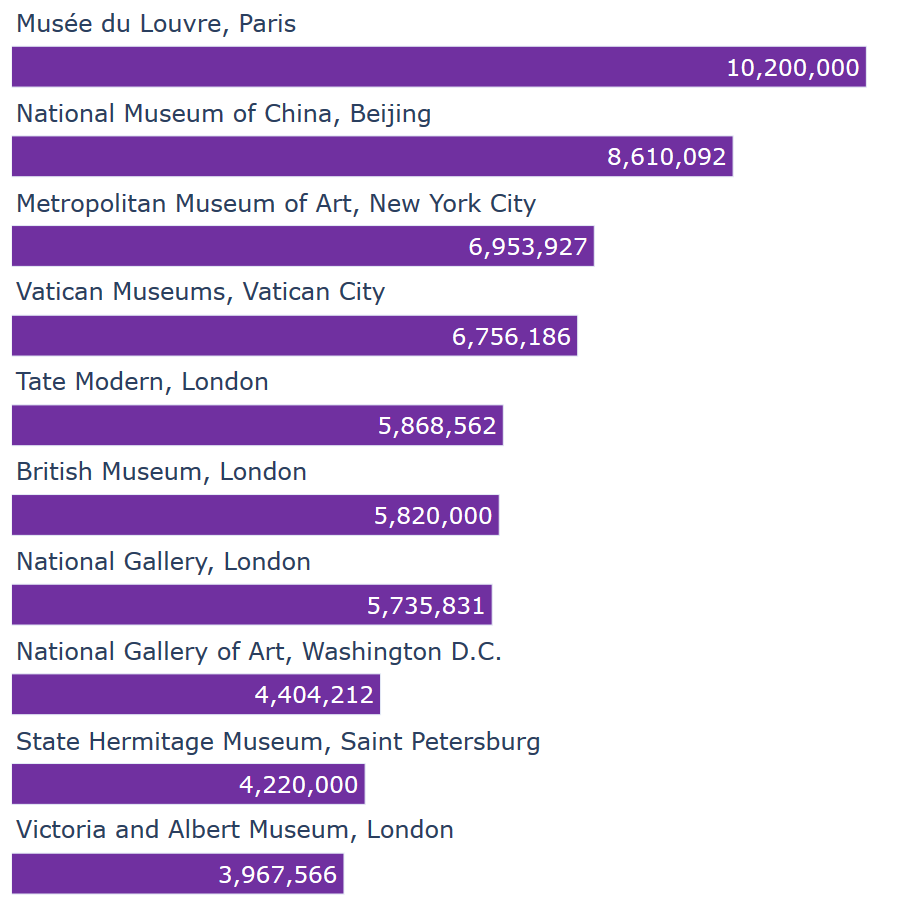
I often find that horizontal bar charts are a great way of visualising comparisons between different categories. They're easy to understand and make, and provide a really simple way of displaying data. But I've found the default way of labelling them often doesn't make sense. Labels for the bars are …
