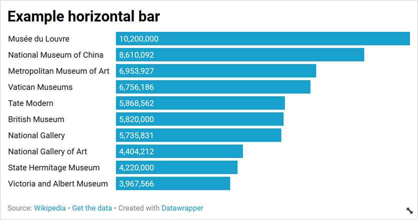
I often find that horizontal bar charts are a great way of visualising comparisons between different categories. They're easy to understand and make, and provide a really simple way of displaying data.
But I've found the default way of labelling them often doesn't make sense. Labels for the bars are usually presented to the left of the axis, and often have to be crammed together, split across multiple lines or truncated to make them readable.
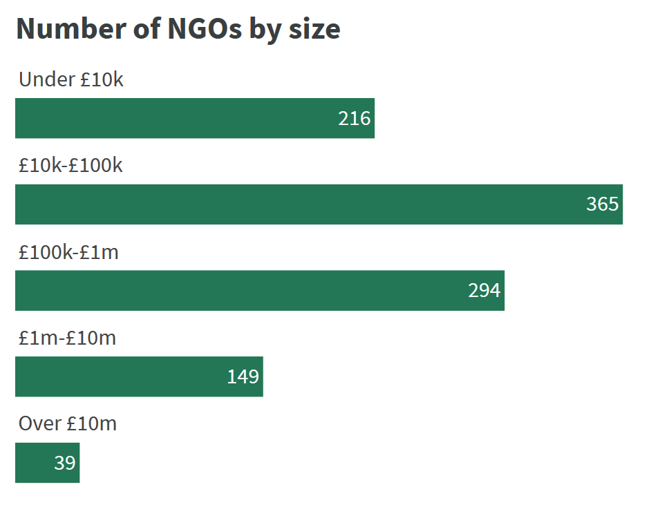
Some charting tools can produce a much easier to read version, where the labels for the bars appear on a separate line to the bars themselves. This gives the data itself more room to breathe and makes the labels less cramped.
Here's an example from DataWrapper using some of their sample data. First using their default settings:
And then with the "labels on separate line" options selected:

Implementing in plotly
I've been using Plotly for charting a lot recently, particularly in conjunction with Dash for making rich interactive dashboards. It's a very powerful combination.
I built 360Insights using Dash, and plotly's charts powers the charts on NGO Explorer. I wanted to record how I created the charts with labels above the bars in NGO Explorer. You can see some examples of these on a country page.
Making subplots
The only way I could find to accomplish the same effect in plotly was to use subplots. These essentially split the figure into a number of different charts. What we're going to do is use a different subplot for each chart, using the make_subplots function.
Start by importing the make_subplots function.
from plotly.subplots import make_subplots
Add our data to the categories variable.
categories = [
    {"name": "Musée du Louvre, Paris", "value": 10200000},
    {"name": "National Museum of China, Beijing", "value": 8610092},
    {"name": "Metropolitan Museum of Art, New York City", "value": 6953927},
    {"name": "Vatican Museums, Vatican City", "value": 6756186},
    {"name": "Tate Modern, London", "value": 5868562},
    {"name": "British Museum, London", "value": 5820000},
    {"name": "National Gallery, London", "value": 5735831},
    {"name": "National Gallery of Art, Washington D.C.", "value": 4404212},
    {"name": "State Hermitage Museum, Saint Petersburg", "value": 4220000},
    {"name": "Victoria and Albert Museum, London", "value": 3967566},
]
Create as many subplots as there are categories. For each subplot we'll set the title to the name of the museum using the subplot_titles parameter. We also set shared_xaxes=True to ensure that all the bars are still in proportion to each other, and print_grid=False to make it seamless between the plots (otherwise each would be in a box.
The vertical_spacing parameter is important, but can be tricky to get right. I've found that 0.45 divided by the number of categories gives a good spacing between them, but you may need to play around with it.
I've also removed the background colour from the subplots, and set the width of the plots.
subplots = make_subplots(
    rows=len(categories),
    cols=1,
    subplot_titles=[x["name"] for x in categories],
    shared_xaxes=True,
    print_grid=False,
    vertical_spacing=(0.45 / len(categories)),
)
_ = subplots['layout'].update(
    width=550,
    plot_bgcolor='#fff',
)
Next we go through each category and add it to the relevant subplot, using the add_trace function.
This functions takes a dictionary with the values and settings for the bar (notice that the y and x values are wrapped in lists because plotly would normally expect a list of values here).
We'll set the marker so they're all the same colour, and add a text label for the amount to the inside of the bar.
for k, x in enumerate(categories):
    subplots.add_trace(dict(
        type='bar',
        orientation='h',
        y=[x["name"]],
        x=[x["value"]],
        text=["{:,.0f}".format(x["value"])],
        hoverinfo='text',
        textposition='auto',
        marker=dict(
            color="#7030a0",
        ),
    ), k+1, 1)
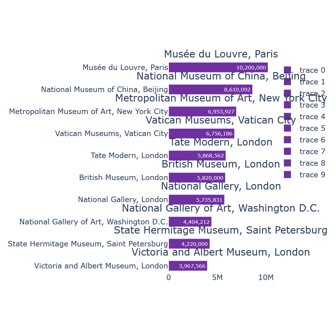
This gives us subplots that are much closer to what we're looking for, but they look a bit of a mess as there's still quite a bit of the layout we need to adjust.
First we remove the legend on the right hand side and make sure the titles (stored by plotly as annotations) are aligned to the left hand side, and have smaller font sizes).
subplots['layout'].update(
    showlegend=False,
)
for x in subplots["layout"]['annotations']:
    x['x'] = 0
    x['xanchor'] = 'left'
    x['align'] = 'left'
    x['font'] = dict(
        size=12,
    )
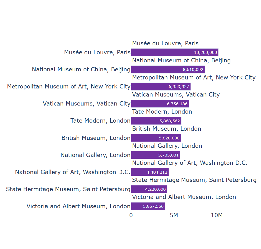
Next we remove all the axes to give a clean look to the chart. If you wanted, you could keep the x-axis to help see the values.
for axis in subplots['layout']:
    if axis.startswith('yaxis') or axis.startswith('xaxis'):
        subplots['layout'][axis]['visible'] = False
Finally we remove the margins at the left hand side, and calculate the height so that the categories fit nicely.
subplots['layout']['margin'] = {
    'l': 0,
    'r': 0,
    't': 20,
    'b': 1,
}
height_calc = 45 * len(categories)
height_calc = max([height_calc, 350])
subplots['layout']['height'] = height_calc
subplots['layout']['width'] = height_calc
subplots
The finished product
I think the final result is a lot clearer than the default chart for the data. I've put together all of this together in a function to help making these types of charts easier.
You can play around with the settings, either as part of make_subplots, the individual bars (add_trace) or the layout (make changes to subplots['layout'].
from plotly.subplots import make_subplots

def horizontal_bar_labels(categories):
    subplots = make_subplots(
        rows=len(categories),
        cols=1,
        subplot_titles=[x["name"] for x in categories],
        shared_xaxes=True,
        print_grid=False,
        vertical_spacing=(0.45 / len(categories)),
    )
    subplots['layout'].update(
        width=550,
        plot_bgcolor='#fff',
    )

    # add bars for the categories
    for k, x in enumerate(categories):
        subplots.add_trace(dict(
            type='bar',
            orientation='h',
            y=[x["name"]],
            x=[x["value"]],
            text=["{:,.0f}".format(x["value"])],
            hoverinfo='text',
            textposition='auto',
            marker=dict(
                color="#7030a0",
            ),
        ), k+1, 1)

    # update the layout
    subplots['layout'].update(
        showlegend=False,
    )
    for x in subplots["layout"]['annotations']:
        x['x'] = 0
        x['xanchor'] = 'left'
        x['align'] = 'left'
        x['font'] = dict(
            size=12,
        )

    # hide the axes
    for axis in subplots['layout']:
        if axis.startswith('yaxis') or axis.startswith('xaxis'):
            subplots['layout'][axis]['visible'] = False

    # update the margins and size
    subplots['layout']['margin'] = {
        'l': 0,
        'r': 0,
        't': 20,
        'b': 1,
    }
    height_calc = 45 * len(categories)
    height_calc = max([height_calc, 350])
    subplots['layout']['height'] = height_calc
    subplots['layout']['width'] = height_calc

    return subplots
A note on log axes
If you're using a log axis, as some of the charts on
Adding something similar to this on the function above should help (where log_axis is a boolean variable):
for x in hb_plot["layout"]:
    if x.startswith("xaxis"):
        if log_axis:
            hb_plot["layout"][x]["type"] = "log"
            hb_plot["layout"][x]["range"] = [1, int(math.log10(max_value)) + 1]
        else:
            hb_plot["layout"][x]["range"] = [0, max_value * 1.1]
Updated 2021-11-25
Thanks to Chris Caudill for pointing out a missing part of the function - this is now included. I've also added the section at the end on log axes.
